MSFT Dynamics Interactive
Project
Delivering “sparkle and pop” under restrictive brand guidelines, tight deadlines, and many, many iterations.Brief
Create an eye-catching interactive experience optimized for large-scale touch displays allowing users to explore Dynamics benefits across six business scenarios.
Layer 1 / Hook
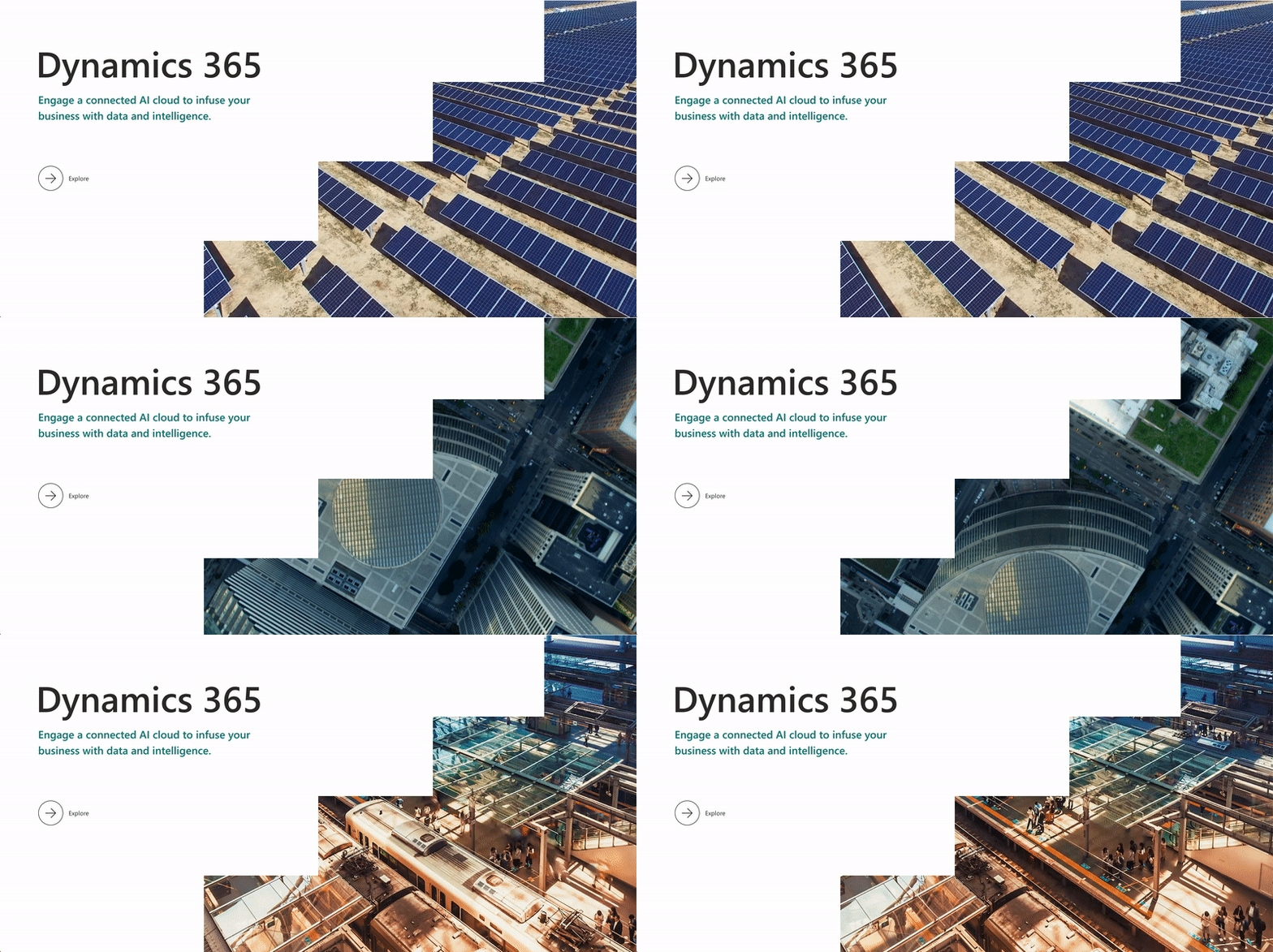
15 second attract loop and 60 second vision video
Layer 2 / Excite
A master hero visual with six clickable sales plays
Layer 3 / Pillars
Up to three clickable information pillars
Layer 4 / Subpillars
A simple, clean layout of four linked subpillars
Layer 5 / Subpillar Features
Feature details on hover and CTA
Layer 6 / Next Steps
Topic-specific links on the final page for each sales play
Brand
Concept
Photography forward
Abstracted bar graphs
Seamless UI transitions
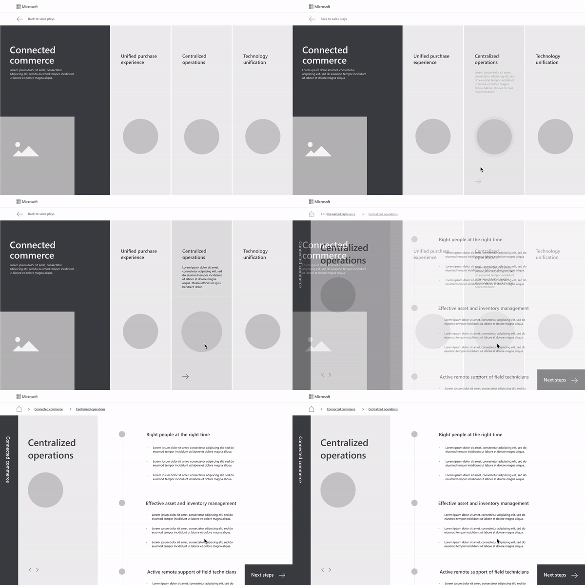
Wireframes
Layer 1 / Video transition
Layer 2 / Hero visual
Layer 3 / Pillars
Layers 4 + 5 / Subpillars + Subpillar Features
Challenge:
Working with endlessly compartmentalized content.
Layers 5 + 6 / Subpillar Features + Next Steps
Prototype — R1
  Dynamics teal as primary color

  Pillar icons

  Collapsing panels + breadcrumbs

  Additional subpillar feature content

  Next steps transition
Prototype — R2
Client feedback:
No green. More transitions and photography throughout subpages.
 Updated photography for each pillar

  More motion for the intro loop

  Leveled up UI transitions
Prototype — R3
Client feedback:
We want a connected diagram overlaid on a modern city but we don't want to lose the multi-level bar treatment.
Complete hero redesign

Slick UI transitions throughout
Prototype — R4
Client feedback:
We're going to need that connected city with icons. Make it more specific. We need more sparkle and pop for these TDMs.
Complete hero redesign again

 Seamless vision video transition

  Sparkle and pop throughout
