Schilling Cider Rebrand
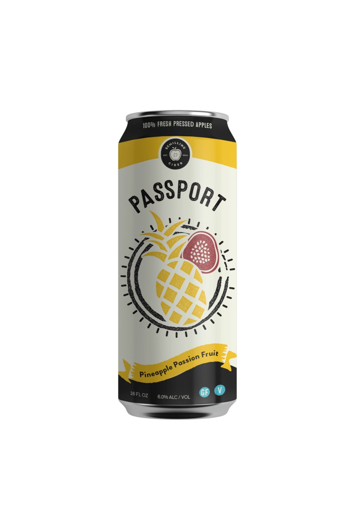
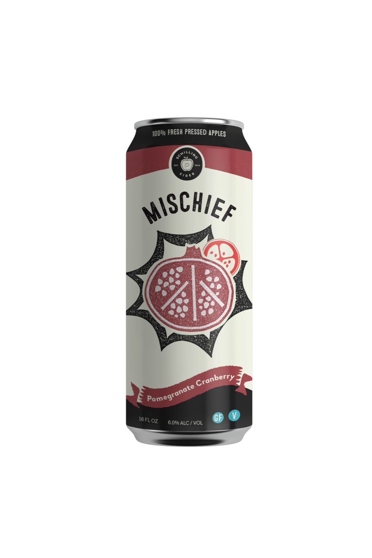
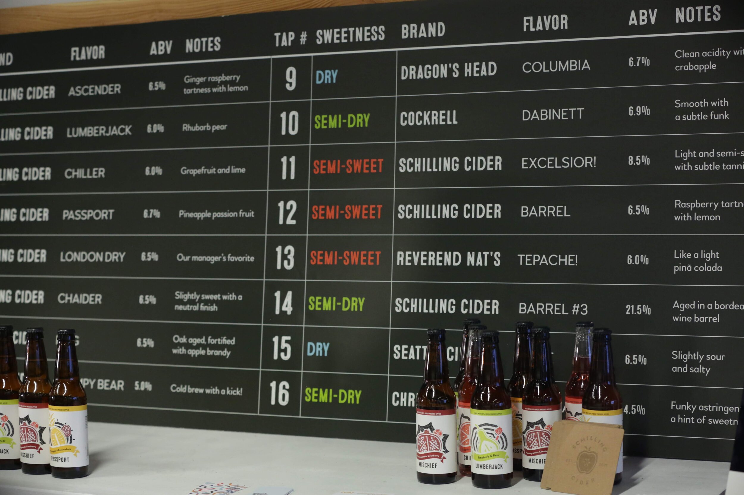
In a competitive market, it's important to stand out so we took on the challenge of a full redesign—creating a cohesive brand identity that captures the warm and inviting feel of a Schilling tasting room.
Challenge
The existing branding, packaging, and illustration style for Schilling is inconsistent and doesn't reflect the friendly character of the company or easy-drinking of their ciders. The challenge was to create a versatile and polished visual system without losing the unique spirit of Schilling.
Logo Design
One of the challenges of creating a logo for a cider company is representing the core of the craft—the apple—in a way that stands out amongst so many competing apple logos. We based our apple sketches on cider mills and through iteration, developed an apple that is distinctive and true to the brand. By highlighting the seeds at the center of the sliced apple, we show that we have nothing to hide—our brand is honest and our ingredients are all natural. The seeds are arranged in a circle and facing each other, a common symbol of community. The mark is subtly textured and worn, showing that it is handcrafted like each and every batch of cider.


